Miltenberger Seminar

Client Details
The Miltenberger Seminar is a seminar held yearly for EMT's. Up until now, the seminar has been done totally through paper. That means every year hundreds to thousands of applications are reviewed, checks collected, and badges hand made for the seminar. View projectSometimes One Page Is All You Need
- Date : July 4, 2016
- Location : Cumberland, MD
The main concerns going into this project were two-fold:
- The Seminar needs a website that contains sign up information and a schedule.
- Sign up information should heavily encourage electronic methods over past paper methods
This may sound simple for most, however the Miltenberger Seminar had never had a website before and all previous sign up was done through papers, checks, cash and manual review. Due to this a simple setup was required.
Problems
Understandably, the leadership at the Miltenberger Seminar were busy planning their conference. Due to this the leadership wanted a quick, easy, set and forget method for electronic sign up.
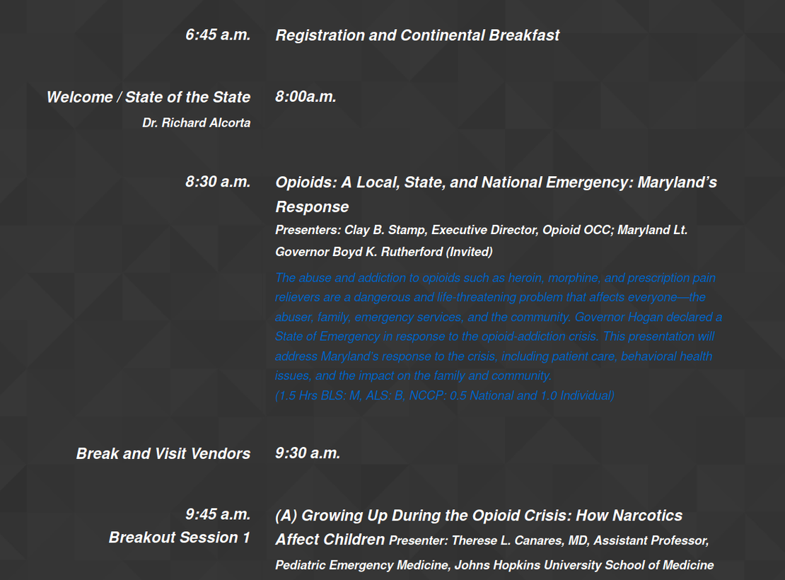
The Miltenberger Conference had previously used print only schedules for the entire week long seminar. As the conference ballooned and hundreds more participants started joining every year this quickly fell apart. Initially the leadership were wearing of using a website based schedule, however after promises that the website and schedule would look great on phones, tablets and desktops; they decided to take the full jump.
Solutions
The registration and sign up problem was simple; registration information was planned to go into prominent places on the website for quick and easy access. A Form Assembly form was generated and permissions for viewing entries were given to key members of the Miltenberger Seminar. This allowed potential attendees to fill out an online form allowing them to register and pay. In addition key members of the Miltenberger Seminar would be able to login to change any verbiage as well as viewing all data collected.
The website issue took much more work. Many hours were dedicated to researching successful seminar websites to decide on the perfect design. Eventually it was decided that a single page app (SPA) would be best. This would allow us to put everything important front and center, keeping the website tight and extremely focused.
The schedule was designed to be accessibly and easy to look at. A modern dark grey geometric pattern was used to reduce strain on attendees eyes, assuming this section would be accessed more than any other on the site. A white larger than average font was used to provide stark contrast to allowing the text to more easily be seen on smaller screens like mobile devices. Each class was staggered and offset allowing sections to be quickly glaced over. All of this put together allowed the site to be great looking on desktops while being extremely functional for tablets or mobile devices even when moving between talks during the conference. At the end of the seminar registration period it was the registration solution saved many hours of time.